 KloudMark
Different brands, different challenges. A selection of projects that show how we work: thoughtful design, precise development and attention to detail.
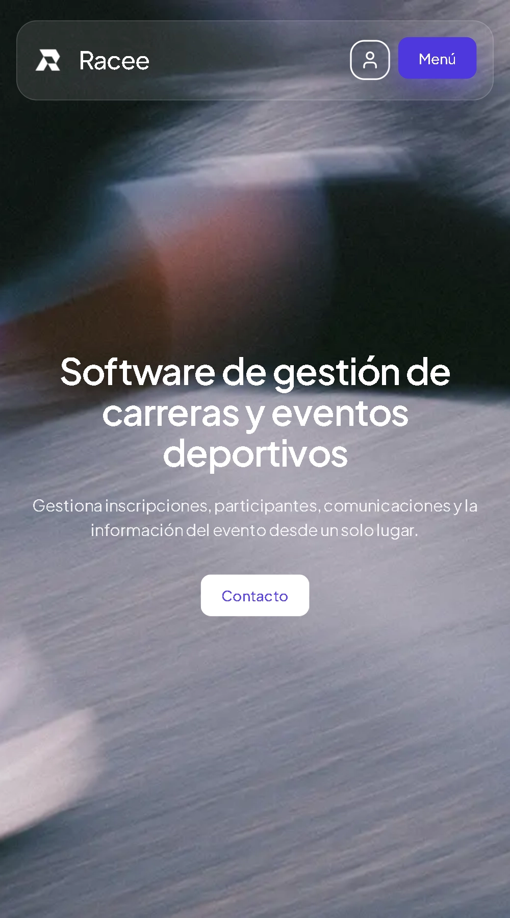
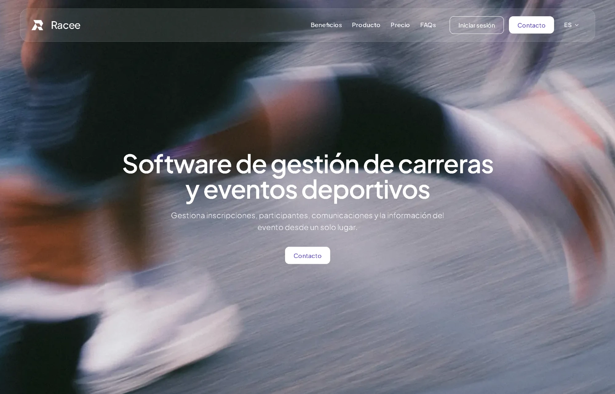
Interface design, technical architecture and development of this SaaS for managing registrations at sporting events. A scalable platform that brings registrations, payments and participants together, simplifies the organisers’ work and offers a clear, smooth sign-up experience.
![Mobile screenshot of the Racee website]()
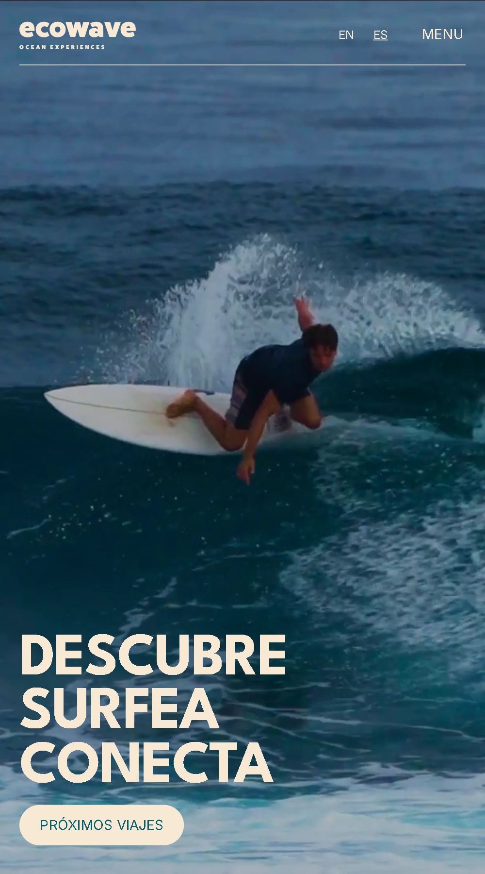
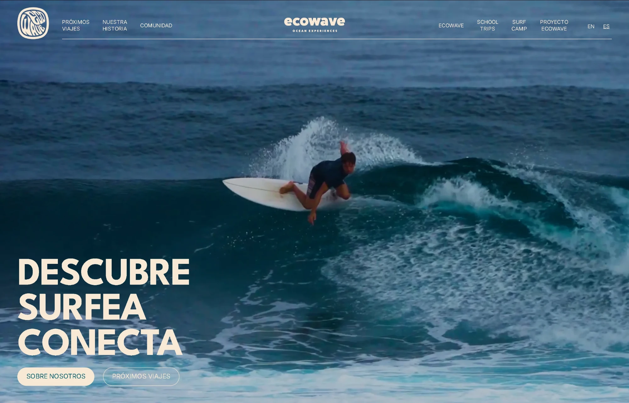
A warm design, with sand tones and large-format photography that brings users closer to the sea and to the spirit of the brand. A website that presents destinations and their itineraries and integrates online trip booking. It includes a simple management system that lets the team publish and update trips completely on their own.
![Mobile screenshot of the Ecowave Trips website]()
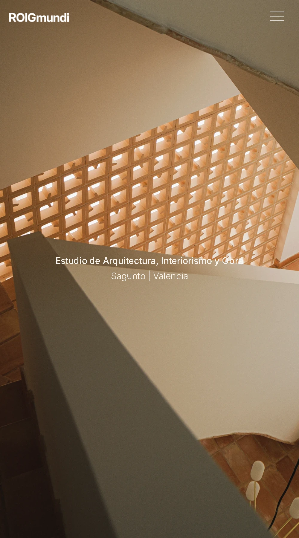
A portfolio with a restrained design, generous spacing and photography at its core. Each project is presented with attention to its materials, proportions and details, in a simple structure that puts the architecture first and lets visitors explore the studio’s work.
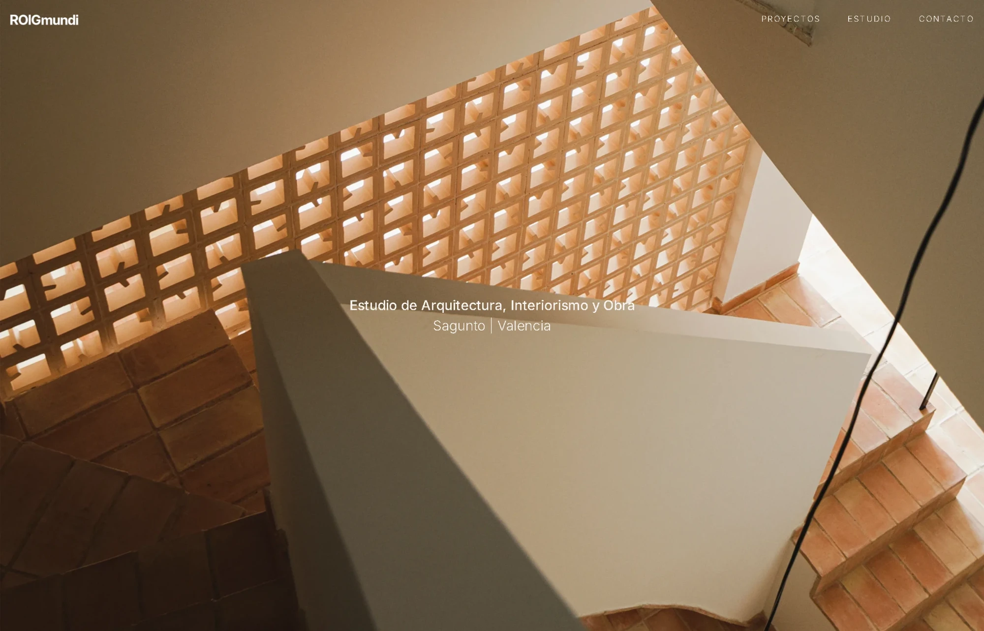
![Mobile screenshot of the ROIGmundi website]()
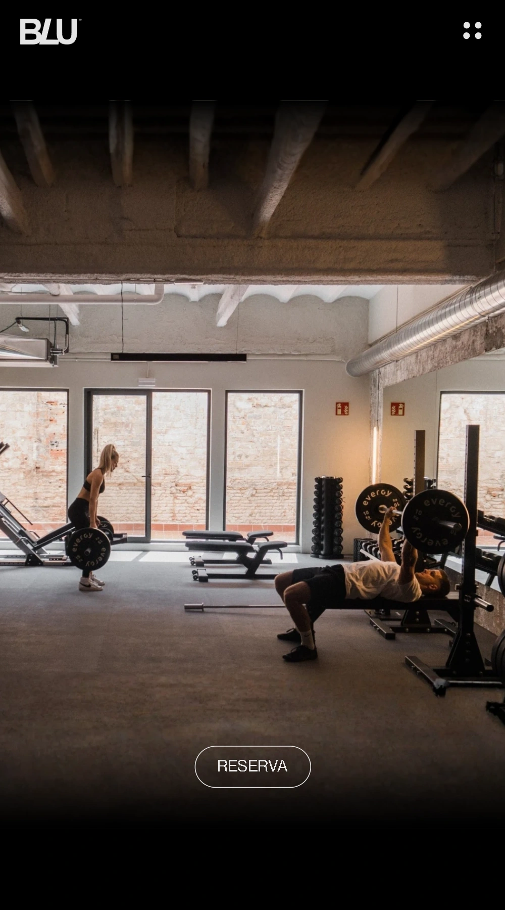
Dark backgrounds, bold typography and large-format videos define the character of this website. Animations and interactions bring movement to the navigation and accompany the presentation of the space, the services and session booking.
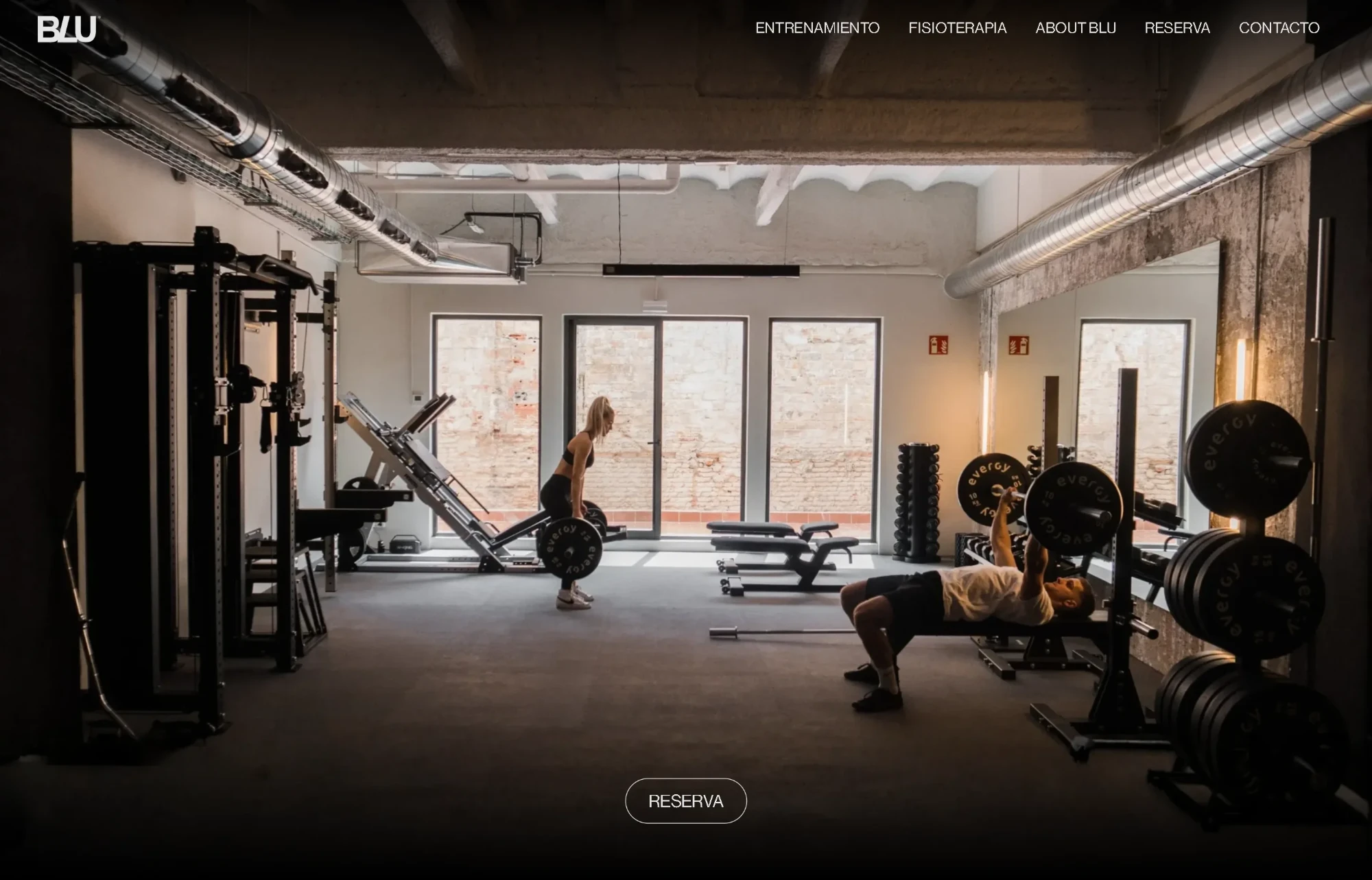
![Mobile screenshot of the BLU Training Club website]()
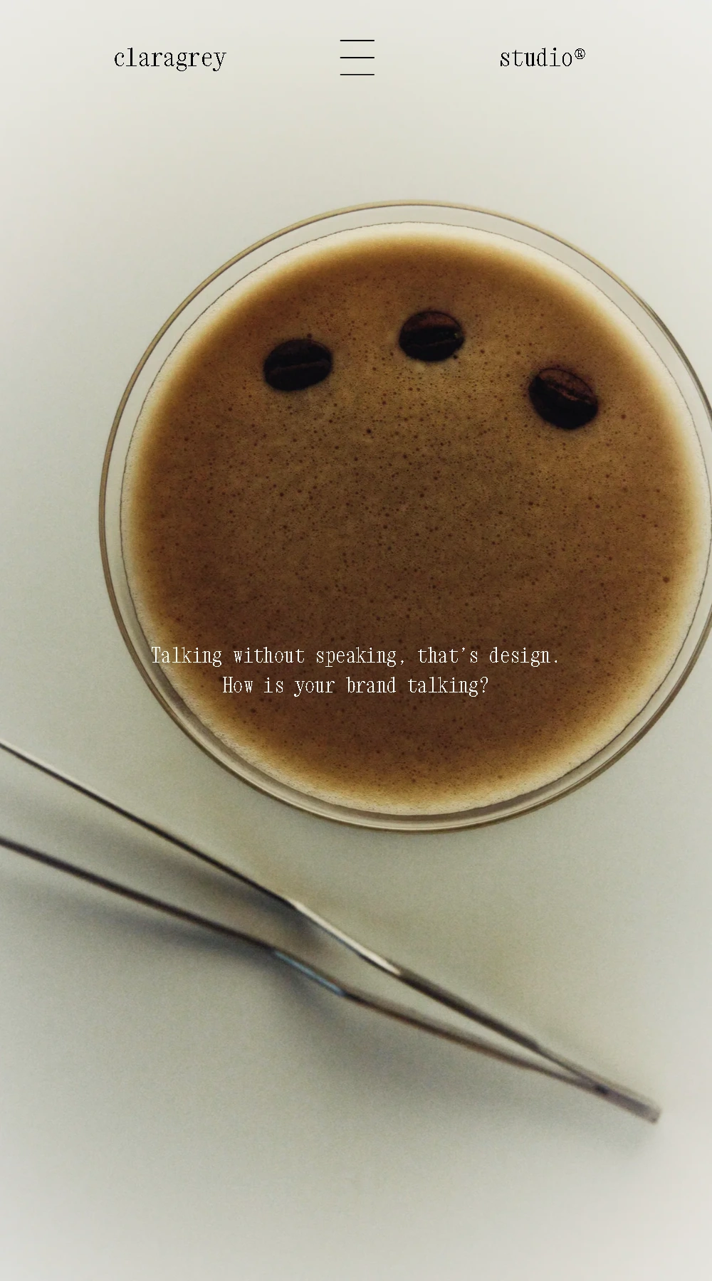
A digital calling card with a refined, editorial style. Photography, typography and space define a minimalist composition that reflects the studio’s personality.
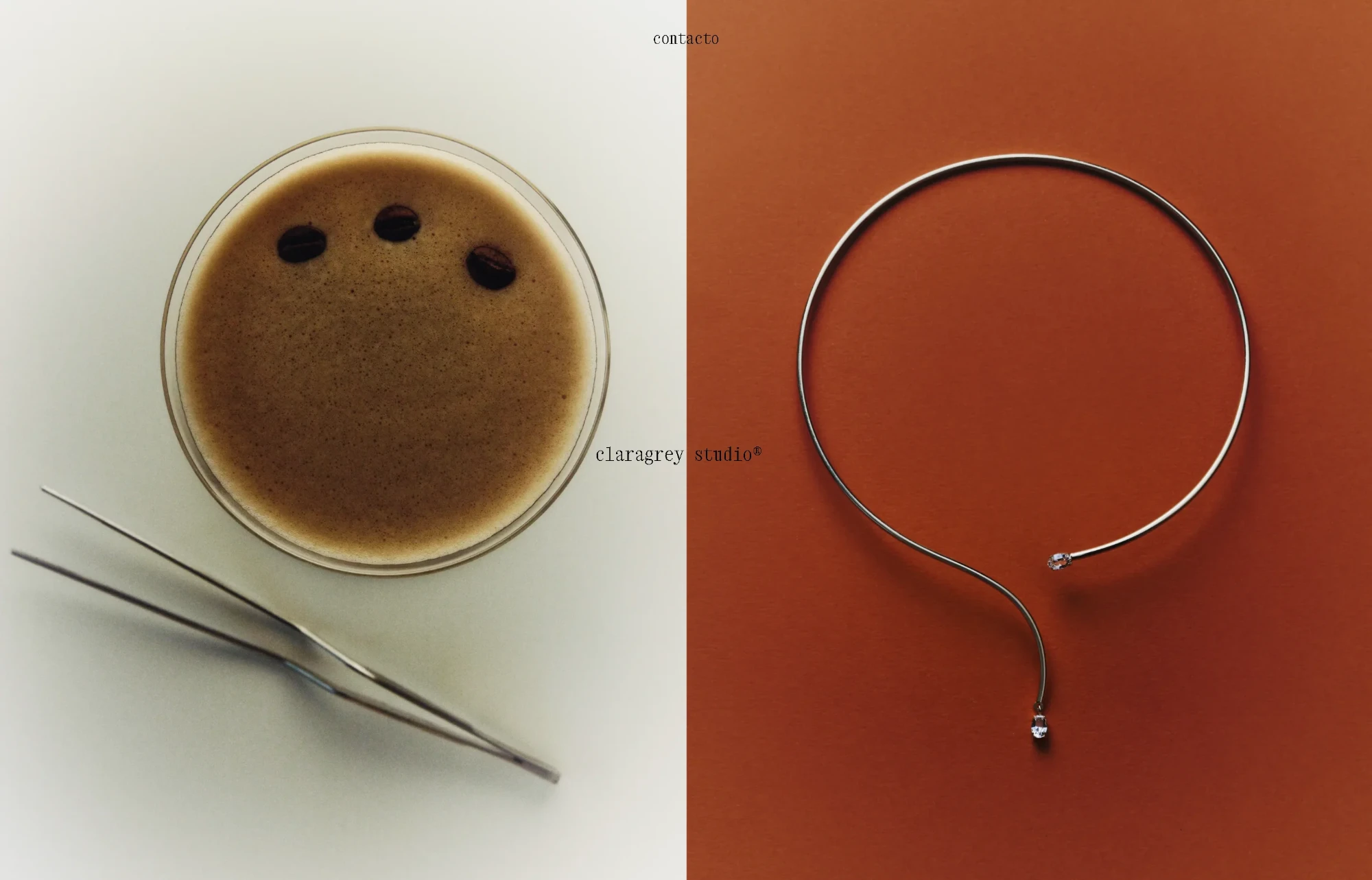
![Mobile screenshot of the claragrey studio® website]()
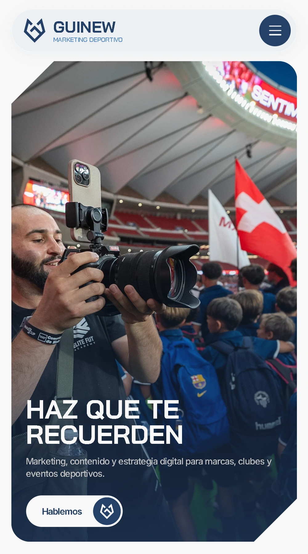
A sporty design, with bold typography and graphic elements inspired by the brand’s identity. It presents the agency’s services and projects, putting the results of each piece of work in the spotlight.
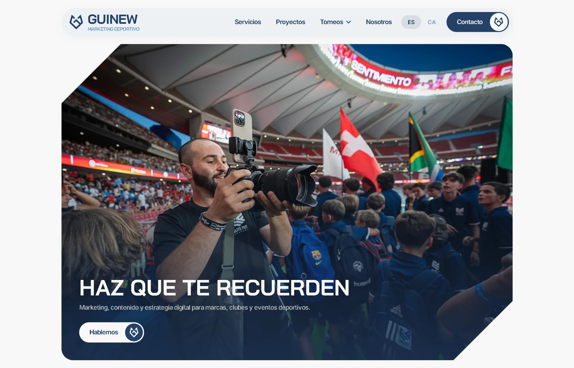
![Mobile screenshot of the Guinew website]()
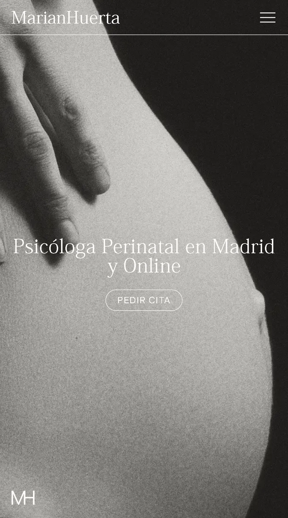
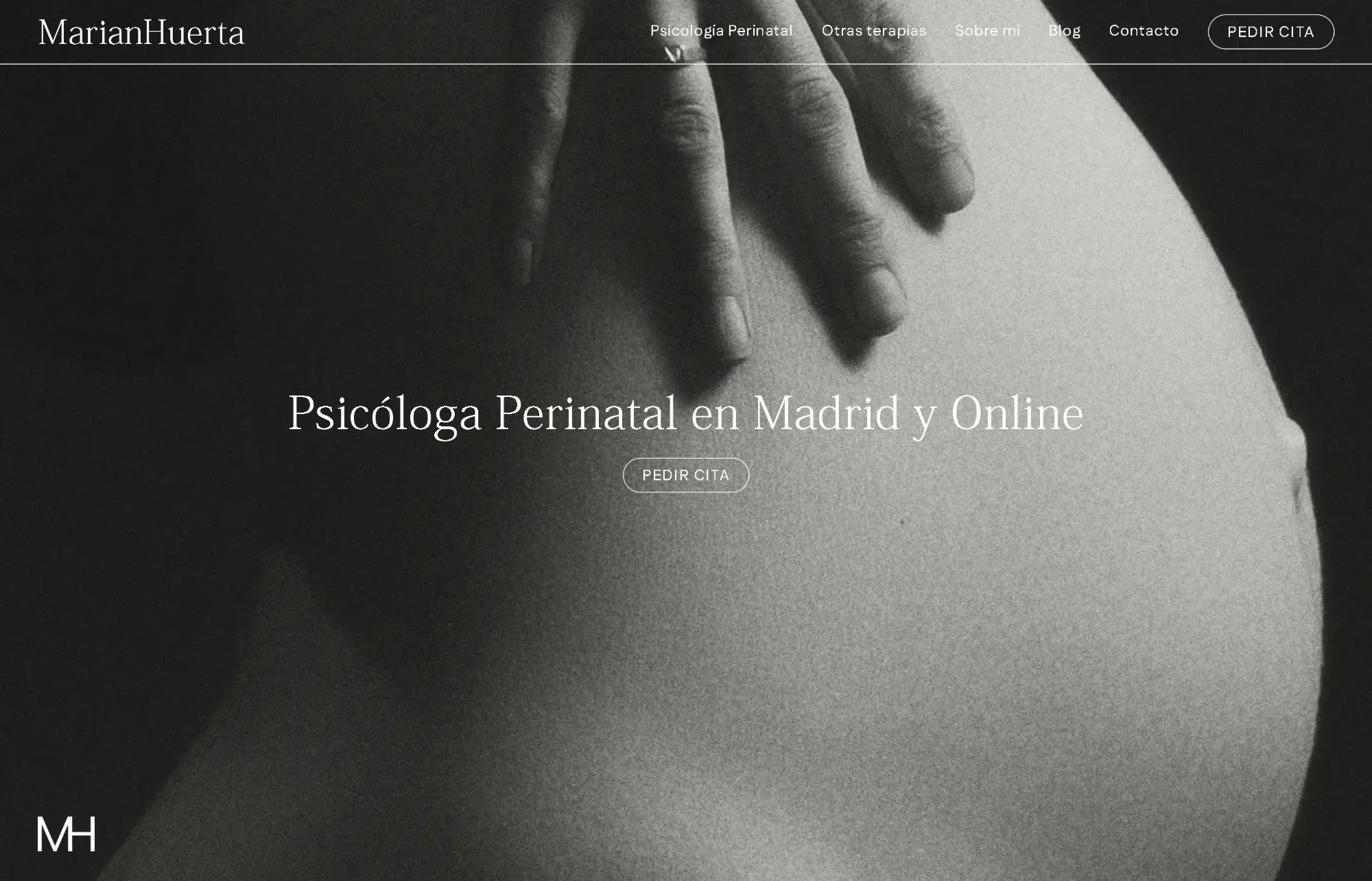
Serif typography, neutral tones and black-and-white photography define a calm, approachable aesthetic. A clear structure that introduces the therapy areas and makes it easy to book a first appointment.
![Mobile screenshot of the MarianHuerta website]()
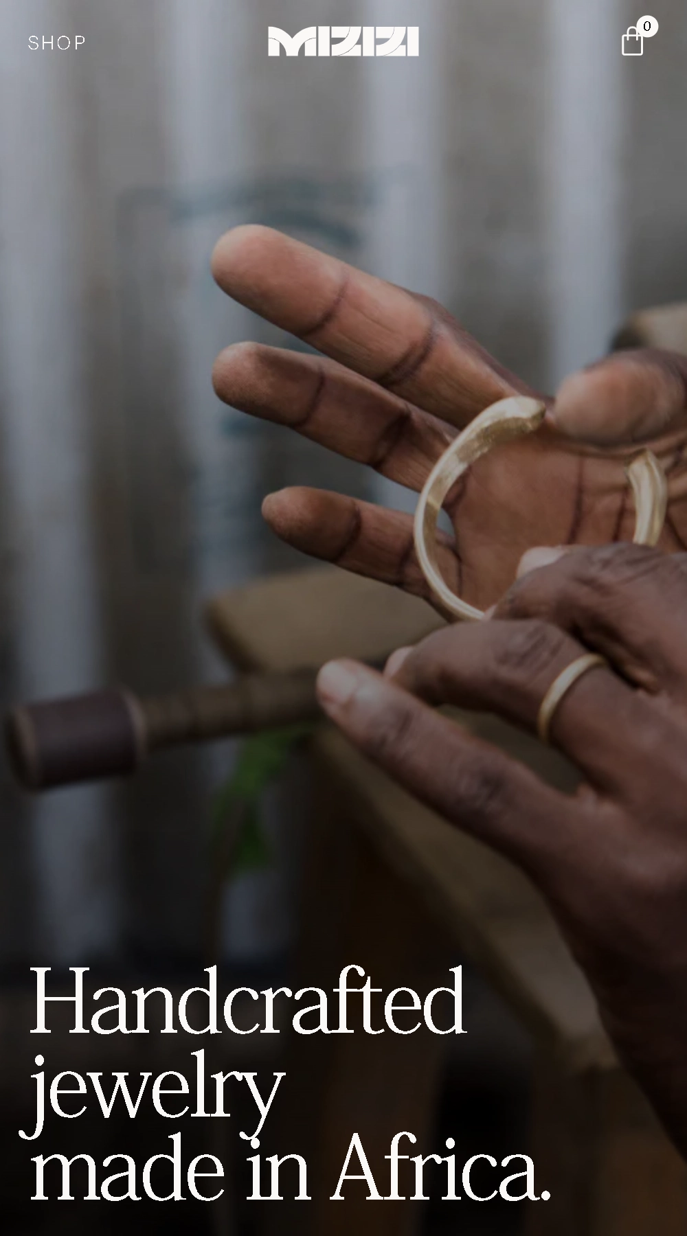
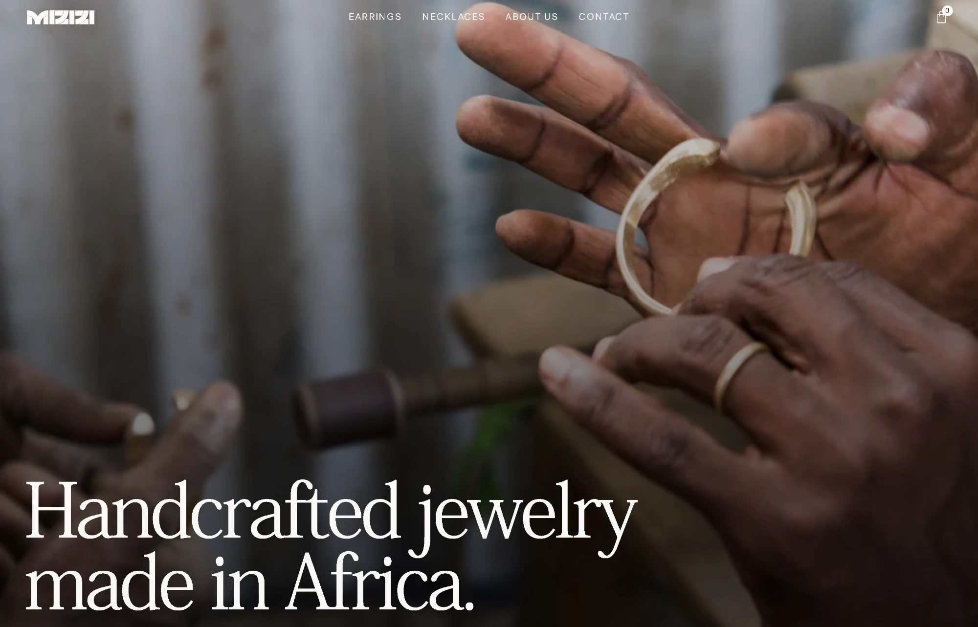
Serif typography, warm tones and generous spacing that put the jewellery, its colours and its materials centre stage. An e-commerce site that presents the collections alongside their origin and handcrafted process, with clear navigation and a carefully crafted shopping experience.
![Mobile screenshot of the Mizizi Art website]()
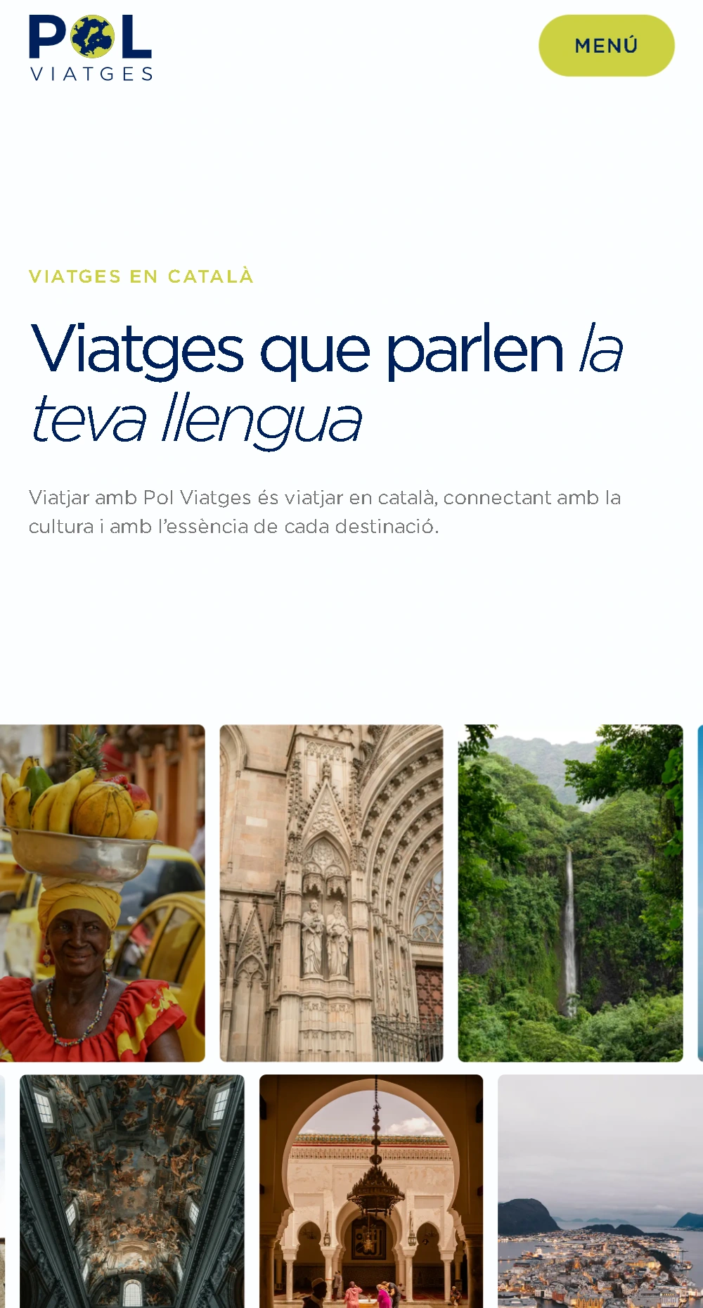
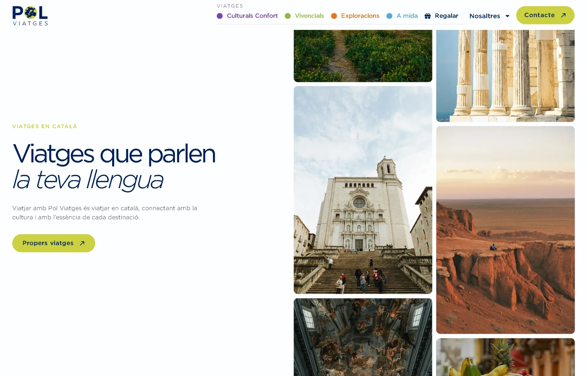
A bright design with a colour code that distinguishes three lines of trips according to the traveller’s profile. Destinations, calendar and itineraries are organised to make each proposal easy to explore. A self-managed website that lets the team publish and update trips completely on their own.
![Mobile screenshot of the Pol Viatges website]()
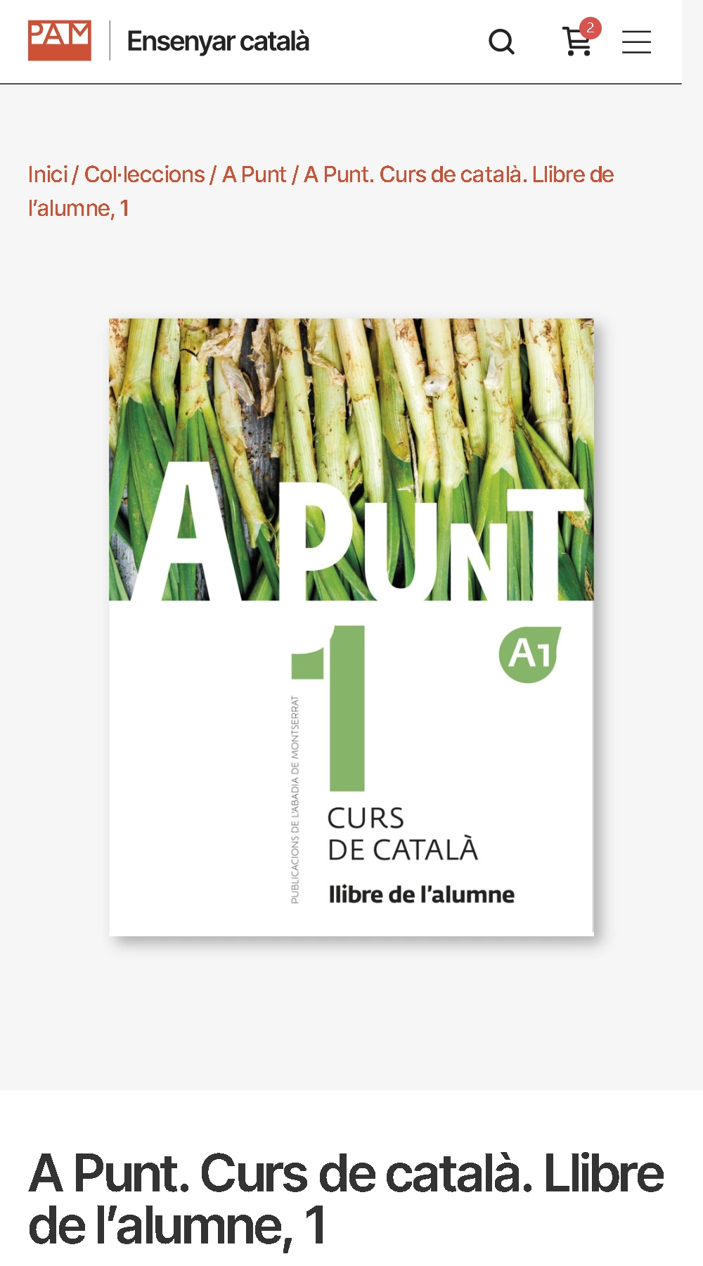
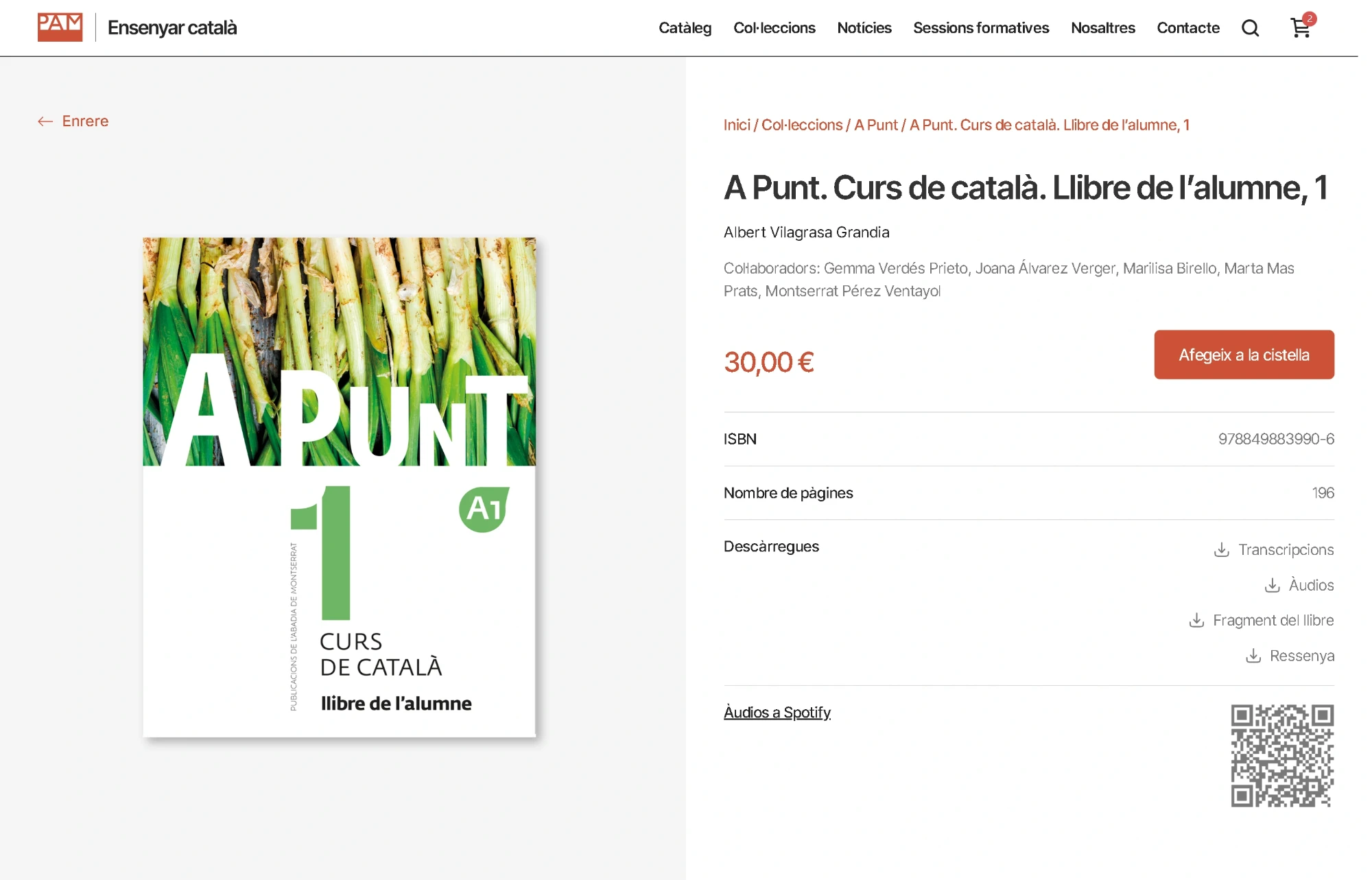
An e-commerce site that brings together books and materials for learning and teaching Catalan, with a catalogue organised by collections and levels. Online shopping is integrated with teaching resources and content for teachers and students, in a clear structure that makes it easy to browse and choose each publication.
![Mobile screenshot of the Ensenyar Català website]()